MicroAire Visual Identity
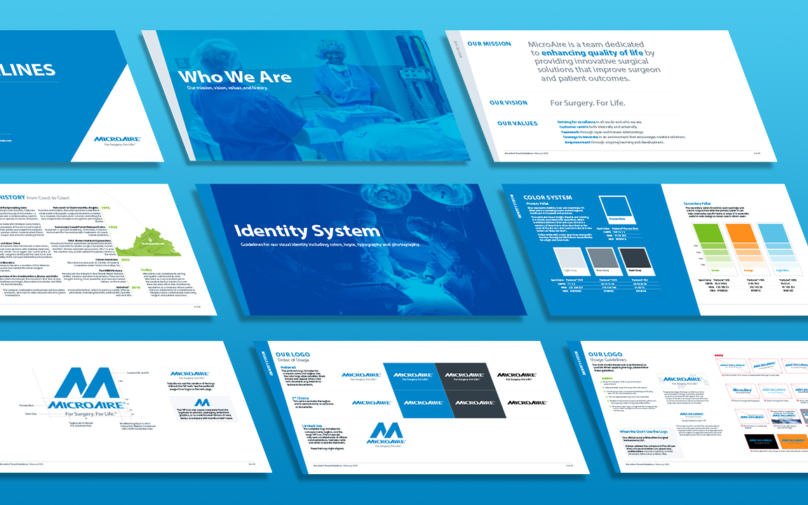
Update the brand's identity to better reflect the business and improve consistency visually between all of their products. However, the company must keep the same logo/wordmark.
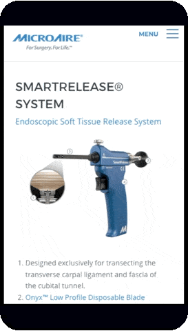
MicroAire Surgical Instruments
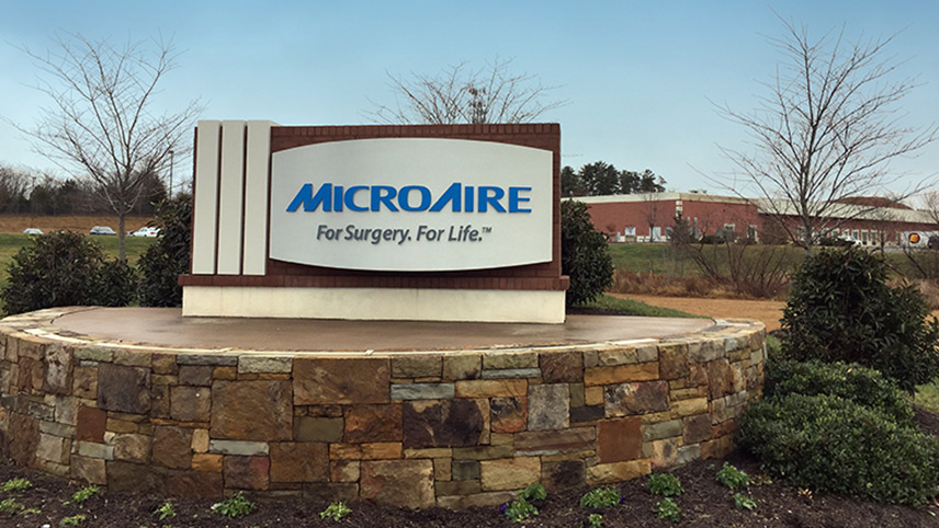
MicroAire designs and manufactures powered orthopaedic and plastic surgery devices in Charlottesville, Virginia.
Previously, the company's primary colors were red and black, which may have been appropriate for the company 15 years ago when they focused primarily on orthopaedic power. Learn more about the process in the case study:
Pantone Process Blue
#0085ca
“Color does not add a pleasant quality to design — it reinforces it.”
Pierre Bonnard
MicroAire's brand needed to communicate a professional, credible and safe medical device manufacturer. Their previous color schemes (red/black and blue/green) were not only outdated, but also no longer aligned with the company goals, including combining their segmented products (othopaedics and aesthetics) together under one umbrella.
The new color scheme represents stability, trust and cleanliness. Blues are often seen in operating rooms and throughout healthcare in hospitals and practices. Before the refresh, blue was already in use on the device hand pieces themselves for several years. A secondary palette is provided to help emphasize specific items or areas and is especially useful in web design as visual cues to direct users.
Pantone
7541
#dde5ed
Pantone
7554
#768692
Pantone
432
#333f48
Pantone
1495
#ff8f1c
Pantone
2985
#5bc2e7
Pantone
368
#78be20
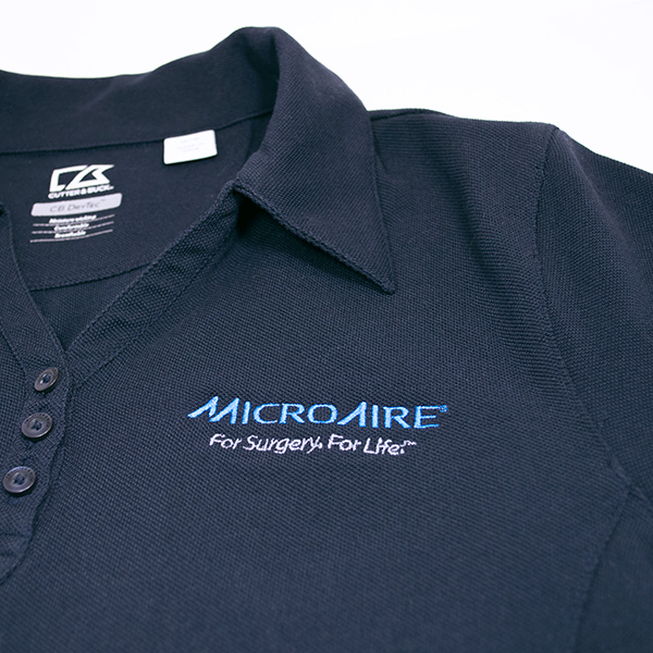
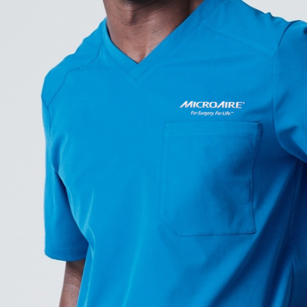
Many elements from the old identity were kept, including the logo. These elements were given a refresh and were applied consistenly throughout.
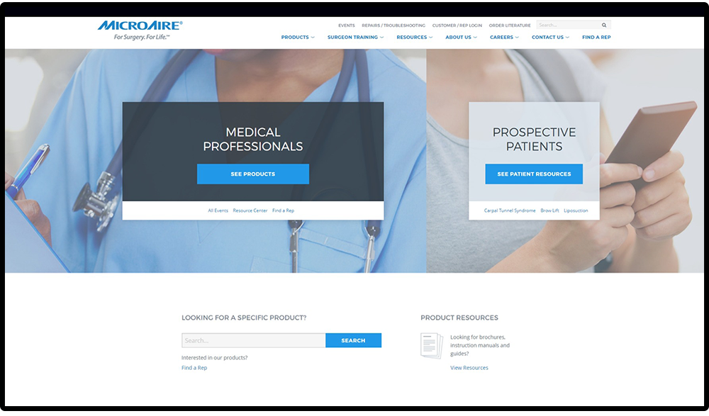
MicroAire's previous website focused on ecommerce sales ordering and tools for sales representatives. Unfortunately, this led to a complex navigation that wasn't tailored to surgeons and wasn't complimentary of the brand. In addition, the outdated experience was not yet optimized for mobile use.
Ultimately, the online experience was redesigned with the updated branding, simplified, and separated from the sales representative tools and ordering experience.
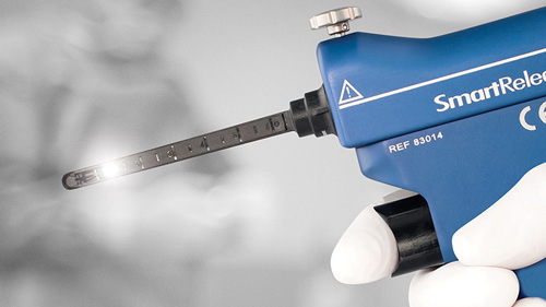
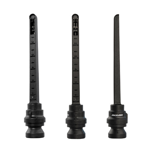
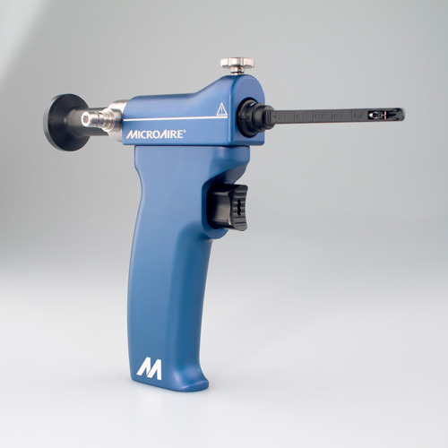
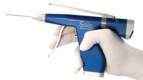
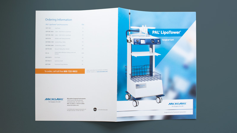
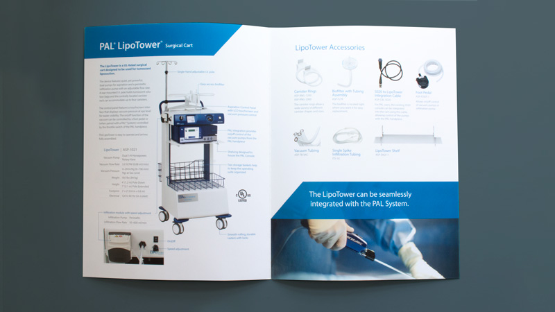
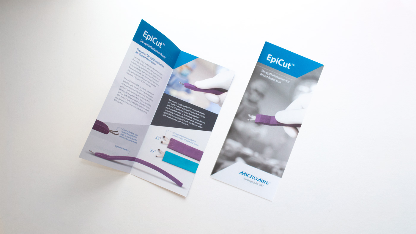
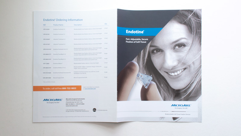
All product photography was shot and edited in-house for use in advertising, marketing and ecommerce websites, and printed literature.
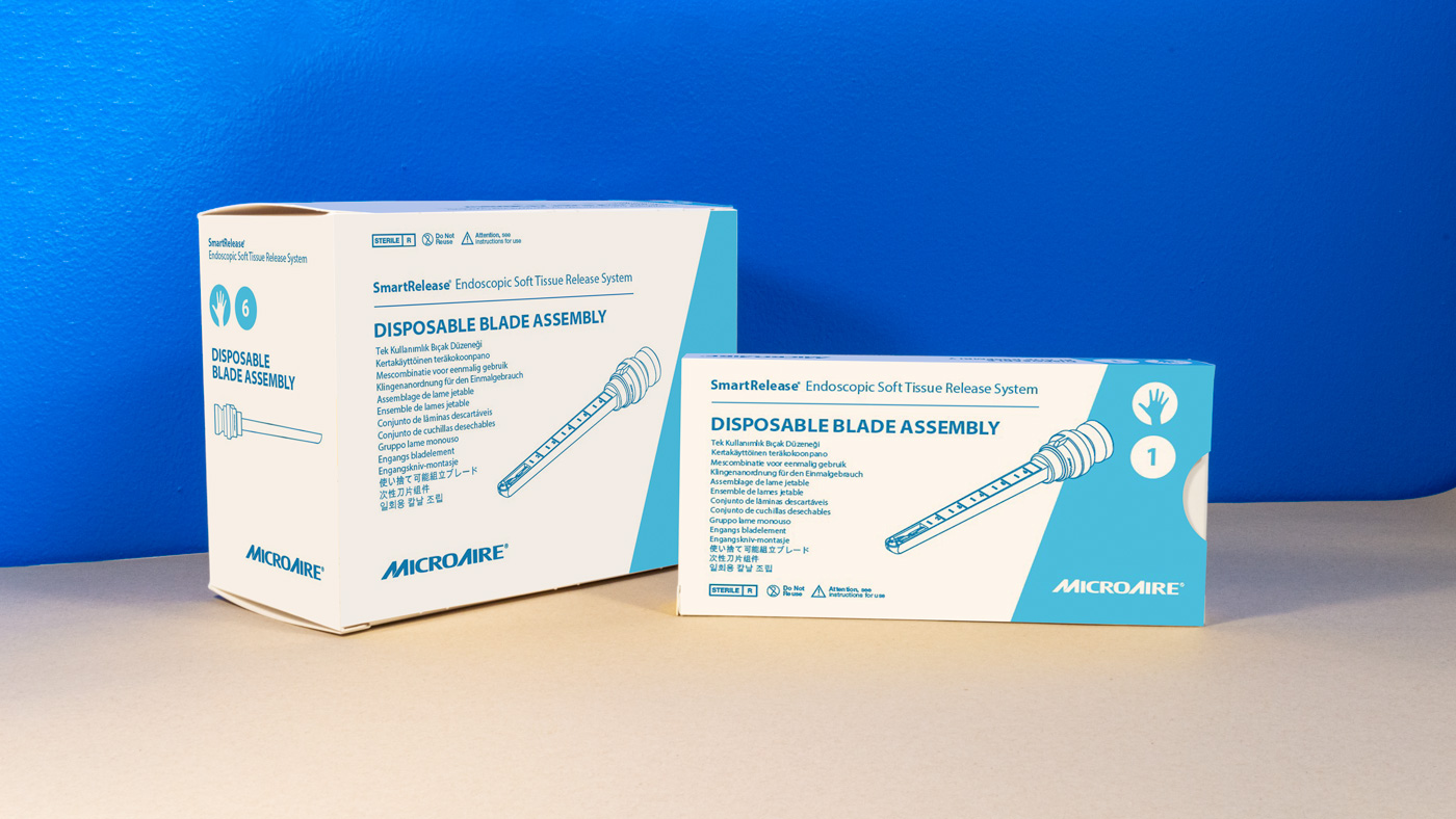
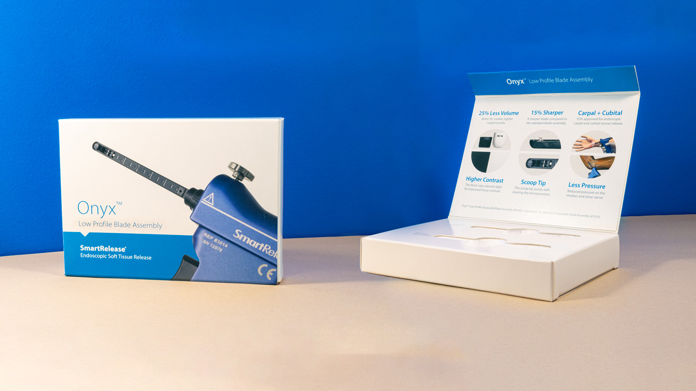
Packaging for some products were updated and simplified for easier identification in storage areas of medical facilities. Demo boxes were rebranded and used as marketing materials for sales representatives.
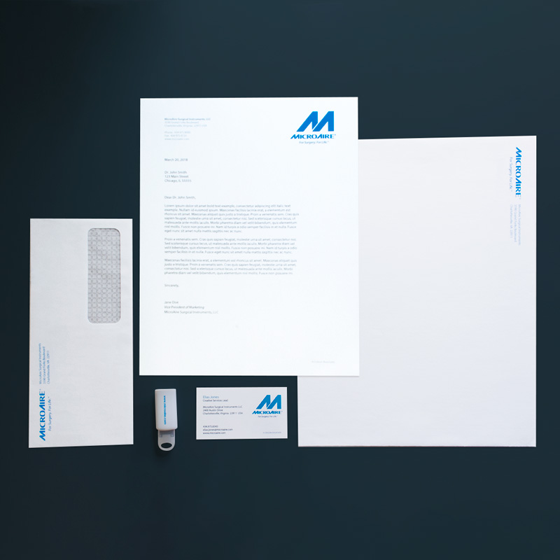
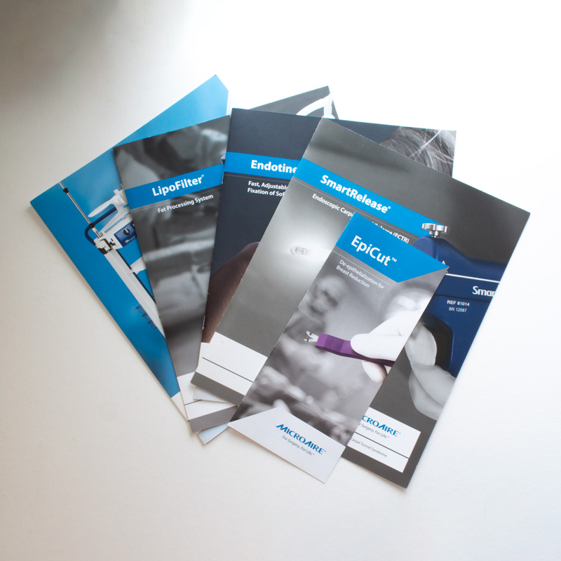
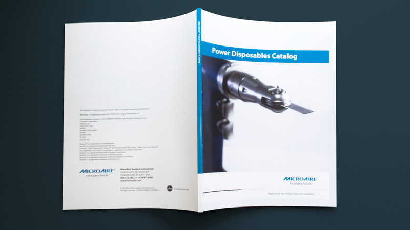
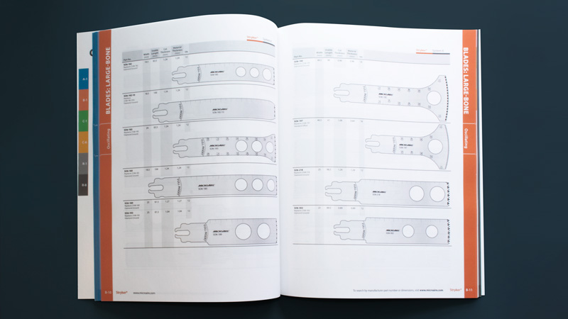
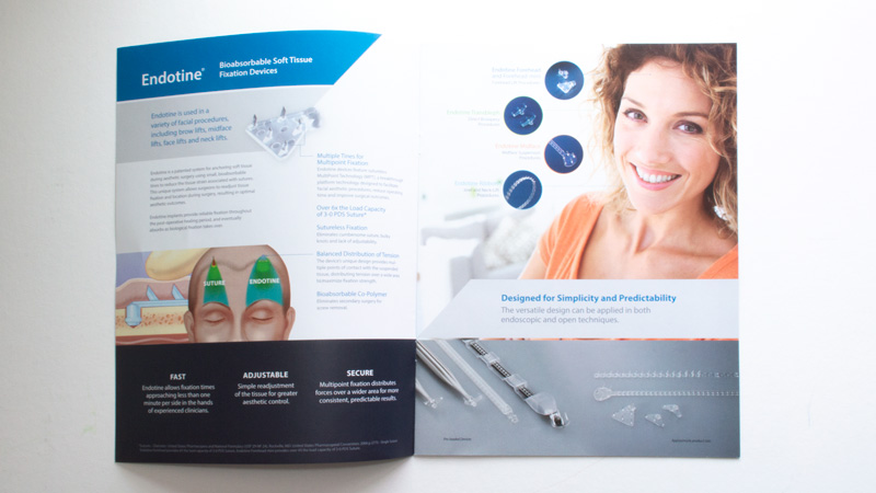
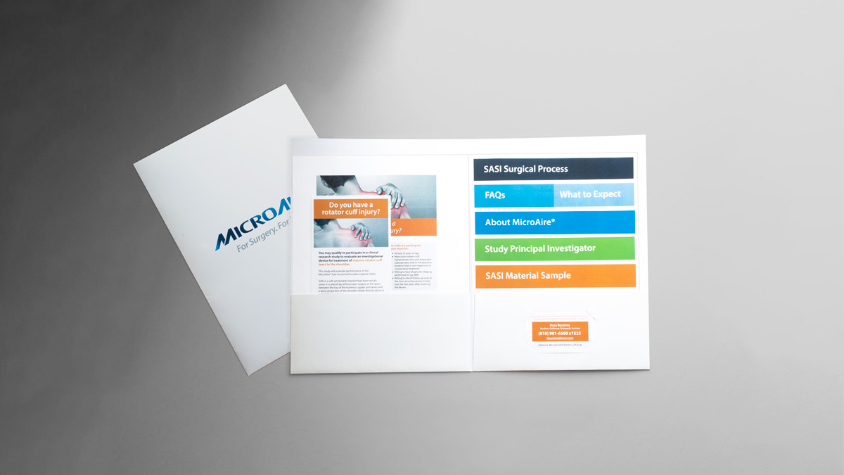
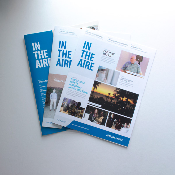
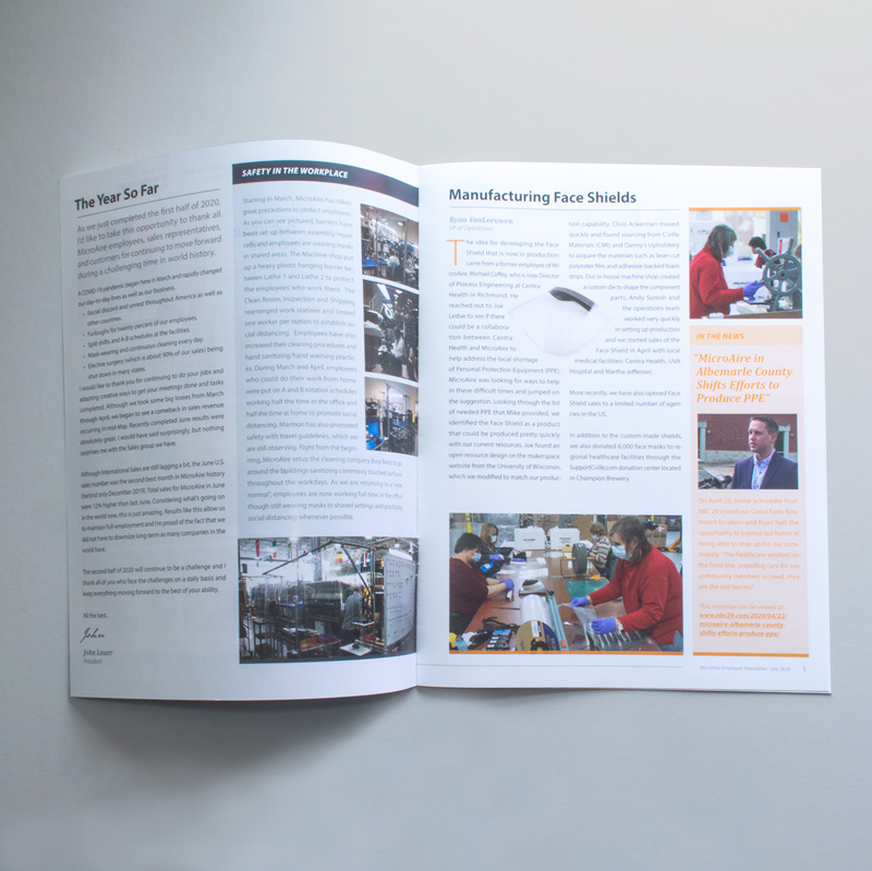
Corporate stationery and literature (including brochures, catalogs, newsletters, and clinical information packets) were redesigned with the new brand standards.
Motion graphics were created and played primarily for tradeshow exhibits.