Challenges
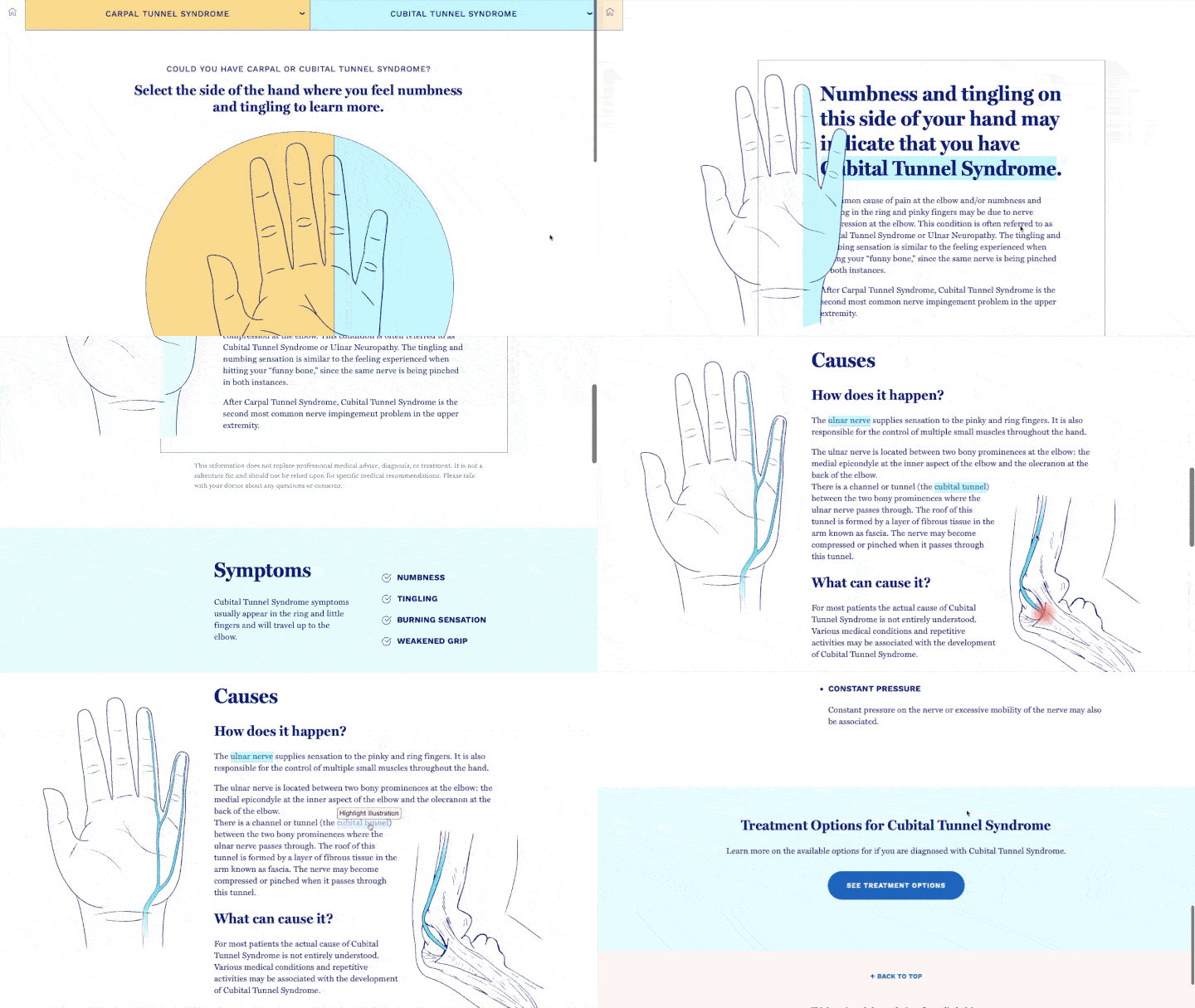
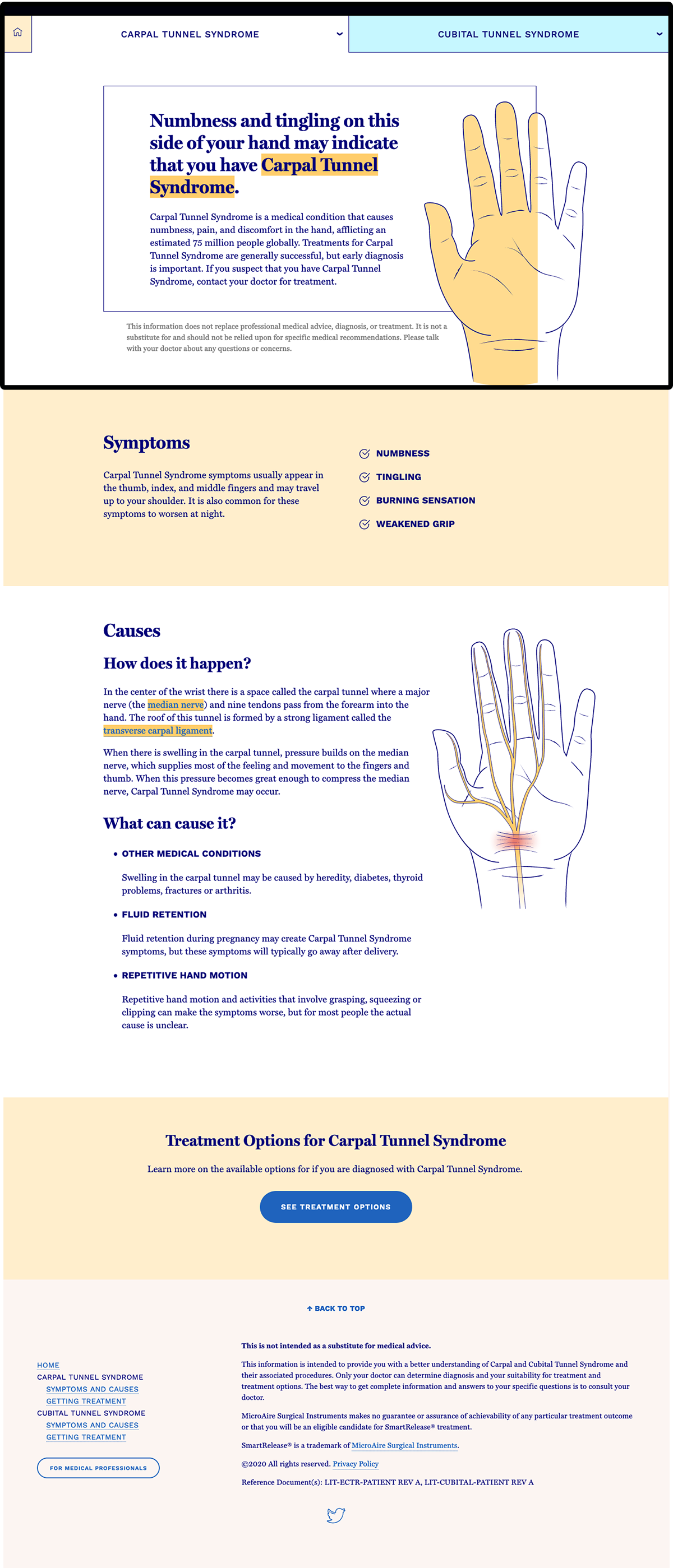
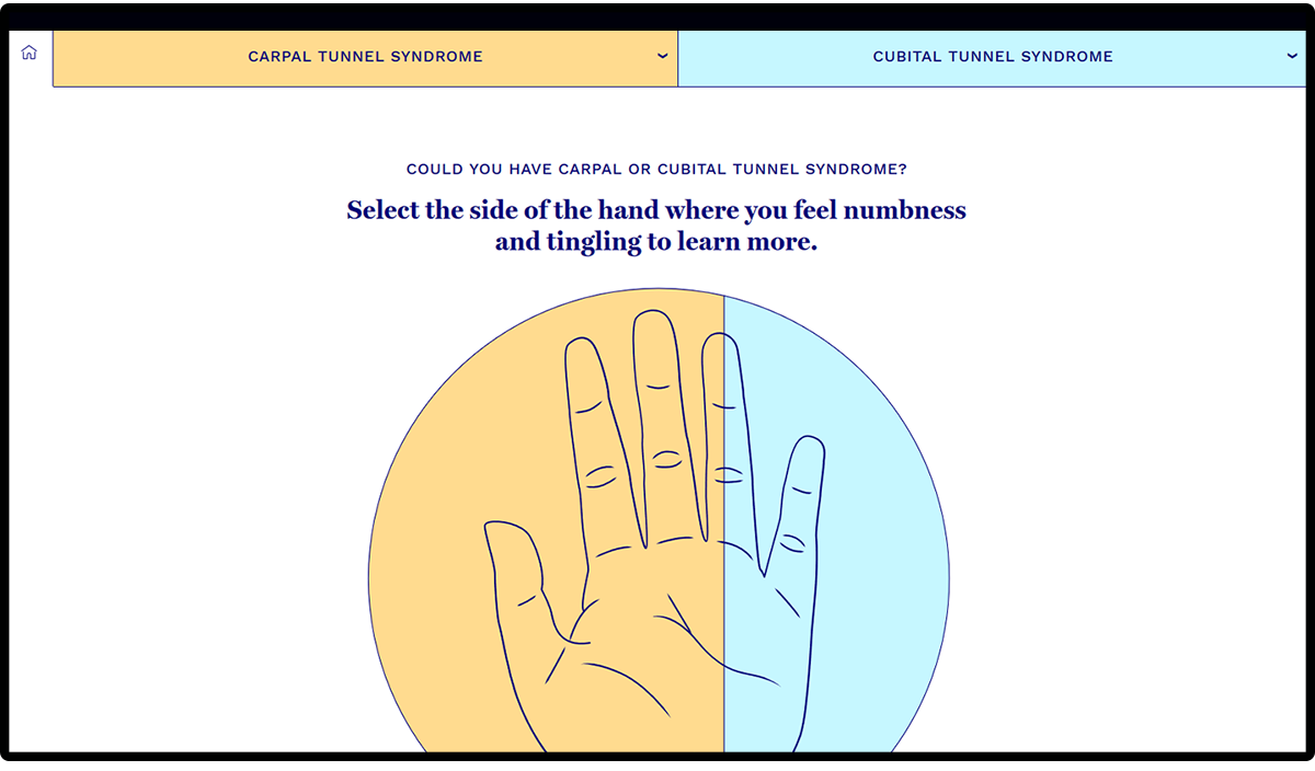
Improve the online resource to educate potential patients on the differences between carpal and cubital tunnel and their procedures.
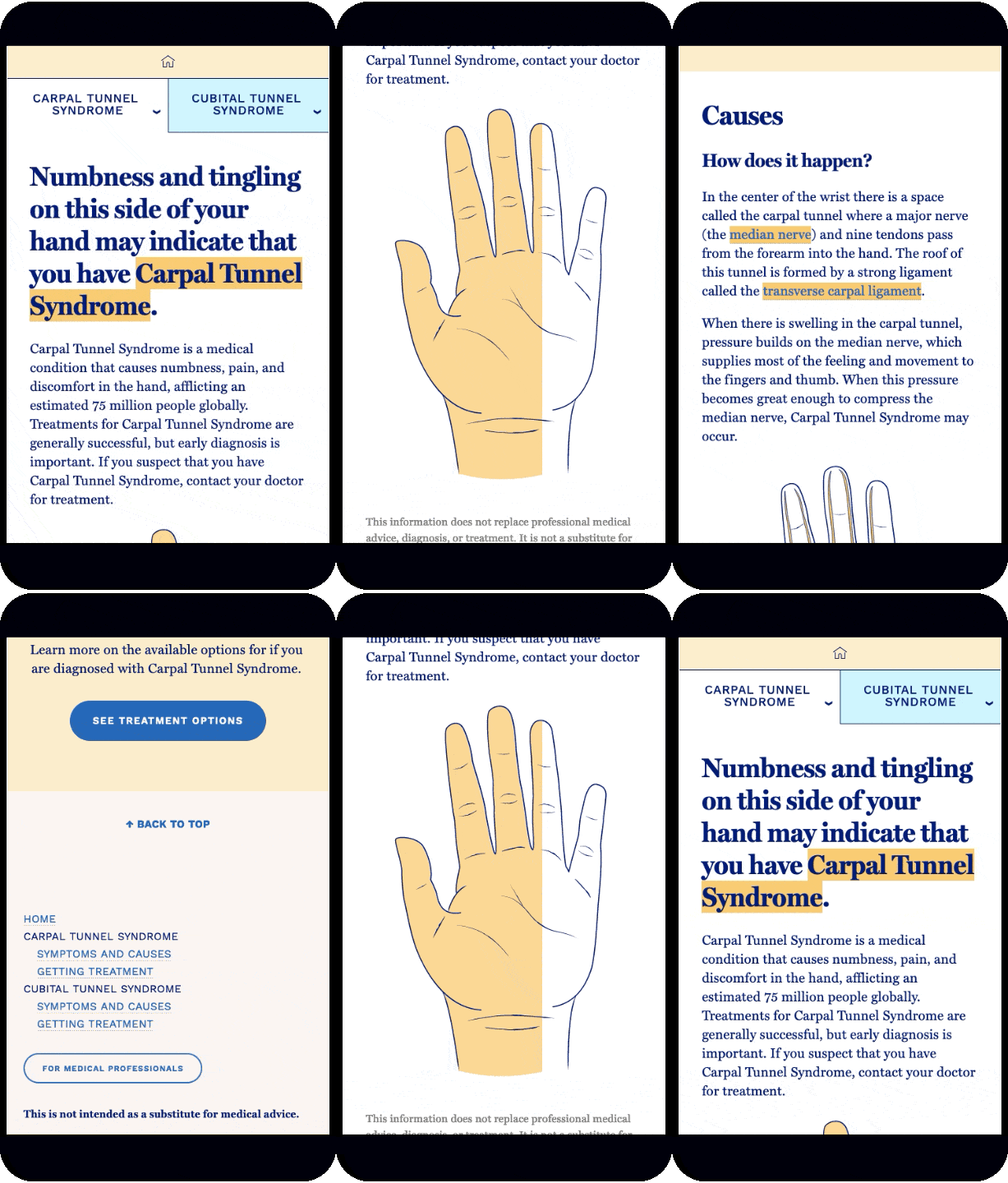
- Reach a larger audience with increased advertising and improved usability for mobile devices
- Educate patients on carpal and cubital tunnel syndromes while also informing them of the endoscopic procedure option
Client
MicroAire Surgical Instruments
Contributors
- Sarah Beth Martin: Design, Development
- Elias Jones: Creative Services Lead
✕
MicroAire has a soft-tissue release device for a minimally-invasive solution to carpal tunnel release procedures.

Go and experience the site for yourself.
Visit SiteColor Palette
Two complementary colors, a soft yellow and bright, light blue, serve as the primary colors that deliniate between both syndromes. Along with off-white backgrounds and dark blue text set with Libre, the palette was chosen to exhute simplicity and trust.
#ffcd6b
#fcf5f2
#c6f7ff
#02007a


Post-Launch Results
+17%

